
Data Visualization Tool
Visualize key metrics to uncover insights faster
Build beautiful, interactive dashboards that make performance easy to understand, and even easier to act on.








See how you’re performing, at a glance
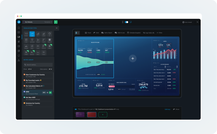
Build no-code dashboards
Create beautiful, fully customizable dashboards with a drag-and-drop builder anyone can use. Add metrics from multiple sources, rearrange or resize them, then style the entire dashboard to match your brand.
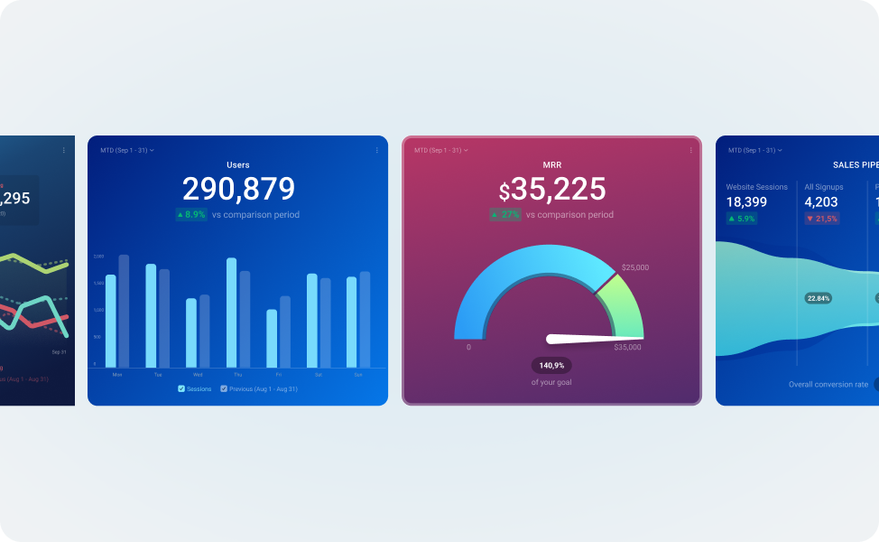
Find the perfect visualization
Choose from 20+ visualization types (including radial, pie, funnel, and more) to present your data clearly and uncover insights faster.
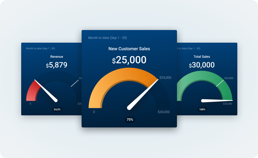
See goal progress
Add goals to your dashboards and reports to track progress visually, with gauges and progress bars that change color dynamically based on performance.
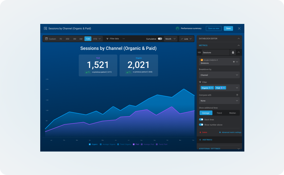
Tailor your visualizations to highlight key insights
Apply filters, choose comparison periods, and display multiple metrics in a single chart.
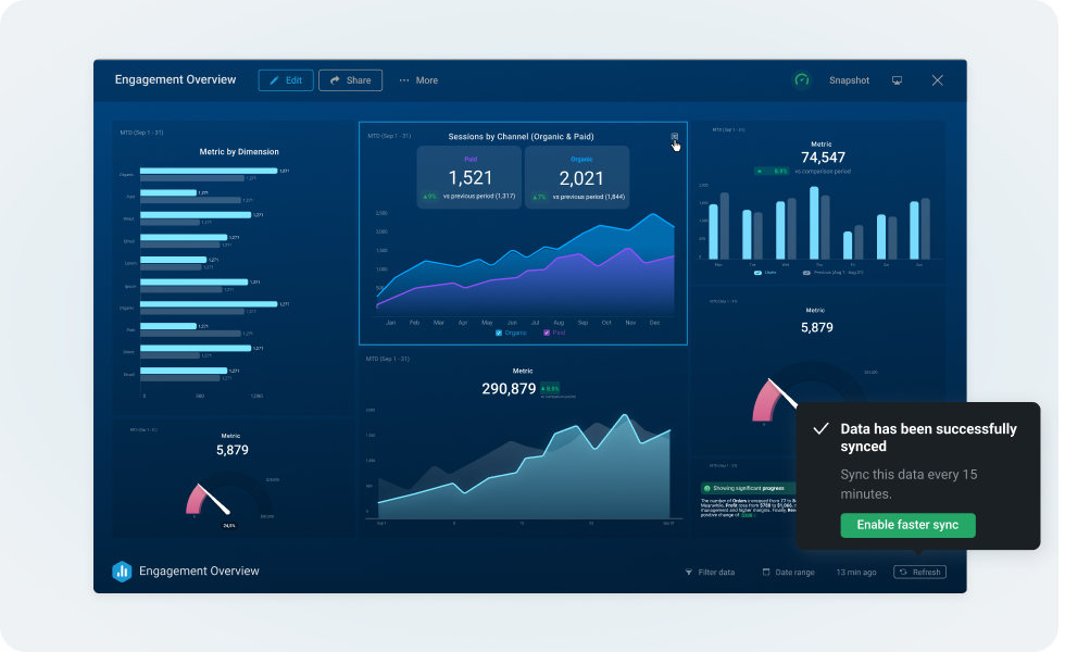
Stay up to date, automatically
Your dashboards update automatically, so you’re always working from the latest data.
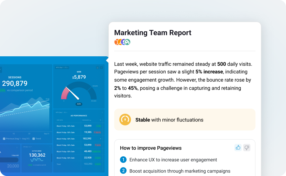
Let AI surface the story
Get automatic summaries generated by AI that highlight key changes in your metrics.
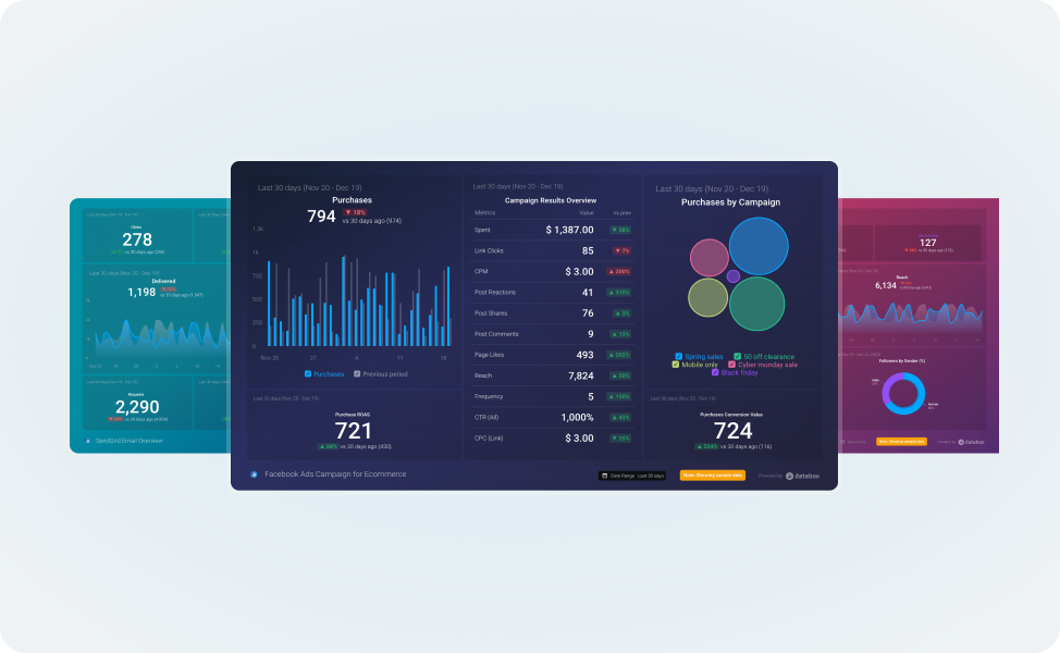
1-click templates
Start with a pre-made template to build a report or dashboard in one click, then customize it for your own needs.


Frequently asked questions
How is Databox different from other BI or dashboard tools?
Traditional BI tools often come with high setup costs, complex data modeling requirements, and a steep learning curve.
With Databox, you don’t need analysts to pull reports, engineers to model data, or extra tools to sync it. You get a modern, all-in-one platform that helps your entire team track performance, surface insights, and make better decisions, faster.
You can get started fast by choosing from 200+ professionally designed templates, or build your own dashboard from scratch using our intuitive drag-and-drop interface. Combine metrics from 130+ popular tools into a single, unified interface and share it however you prefer:
- Share a live link
- Stream it to a TV
- Schedule recurring snapshots
- Embed it in your CRM or website.
Dashboards update in real time and are fully responsive, so they look beautiful on desktop, mobile, TV, or even Apple Watch.
Do I need design skills to build professional dashboards?
Not at all. Databox’s drag-and-drop Designer makes it easy for anyone to build professional dashboards. We automatically apply layout best practices like balanced spacing, font styling, and color usage, so even first-time users can create beautiful dashboards in minutes.
You can also choose to get started with a template. We offer 200 dashboard template options for a range of different industries, data sources, and use cases.
Can I match dashboards to my company or client’s branding?
Yes. You can customize the logo and background color of your dashboards on any paid plan.
For a fully branded experience, including a custom domain and branded login screen, you can purchase the White-Label add-on.
Are Databox dashboards mobile‑friendly?
Absolutely! Databox was built mobile-first.
Our dashboards work seamlessly on desktop, tablet, and mobile, with native apps for iOS, Android, and Apple Watch. They’re fully interactive and responsive, and you’ll get real-time notifications when there are changes in your performance, so you’re always in the loop.
How long does it take to create a new dashboard?
Not long at all.
Whether you start from a pre-built template or build from scratch, Databox is designed to help you get set up quickly. Most users have their first dashboard up and running in a few minutes.
Can I share dashboards with clients or stakeholders who aren’t Databox users?
Yes. Databox makes sharing easy and flexible, even with people outside your account.
You can share dashboards in a variety of ways, including:
- Public or password-protected links (with optional expiration)
- Embeds for websites, intranets, or tools like Confluence
- Scheduled email or Slack snapshots (static image + live link
- TV display with rotating dashboards
What types of visualizations can I use?
Databox offers 20+ chart types, including text and AI summaries.
Choose from line, number, bar, bubble, gauge, heatmap, tables, and more. Each visualization supports goals, multiple comparison periods, and filtering. You can also add AI-generated summaries to help explain the performance of your metrics.
How do I control access and permissions?
Databox offers granular, role-based permissions, so you can control access at the account, data source, or dashboard level.
For added security, you can purchase an Advanced Security Management add-on, which includes features like forced SSO/2FA, activity logs, and session controls. This add-on is included at no extra cost on our top-tier plan.