

TL;DR
- Databox ranks first for sales and CRM dashboards because it connects 130+ sources, defines every metric once, and runs analysis and forecasts on a statistical engine, so its AI Analyst, Genie, explains computed results instead of estimating them.
- In Databox’s Time to Insight survey, 75.68% of teams report from their CRM while 73.13% name data spread across multiple sources as their top reporting challenge, which makes cross-source coverage the deciding criterion.
- HubSpot, Salesforce, and Pipedrive native reporting rank best for teams whose entire revenue motion lives in one system; all three hit a wall the moment a question involves ad spend, billing, or product data.
- Every evaluation should ask where a tool’s AI does its math, since a language model that estimates totals produces wrong numbers that look exactly like right ones.
- Sales leaders without a data team should run one test before buying: ask each tool for pipeline coverage against quota, blended with spend, in under an hour.
Most roundups of sales dashboard software rank features. The useful ranking question sits one level deeper, in your own stack. In Databox’s Time to Insight: What Are the Biggest Roadblocks to Actionable Data? survey, 75.68% of teams named their CRM as a primary reporting data source, and 73.13% of the same respondents named data spread across multiple sources as their biggest reporting challenge. Both numbers describe the same team. The dashboard knows the CRM, but the business runs on six other tools.
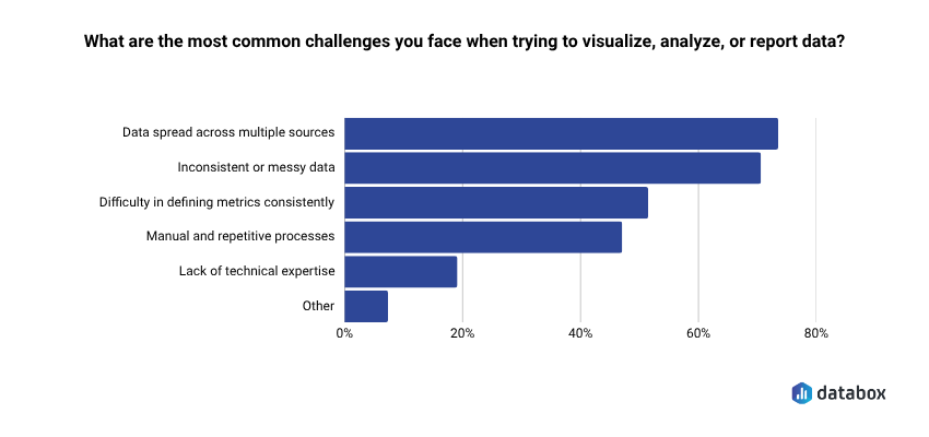
This gap costs real time. A sales leader asking “what did it cost us to create the pipeline we closed last quarter” waits days because the answer lives half in the CRM and half in ad platforms and billing software the CRM dashboard cannot see.
So the ranking below scores every tool on what it can see and compute, with the criteria stated up front.
How to choose the best sales & CRM dashboard software: 5 criteria
Sales performance analytics used to run on a weekly ritual. A RevOps manager exported pipeline from the CRM, pulled spend from the ad platforms, matched closed deals against billing in a spreadsheet, and walked the sales leader through the result on Monday. The CRM dashboard told the part of the story that lived in the CRM, and people stitched together the rest by hand.
AI compressed that ritual into a question. A sales manager now asks why mid-market win rate dropped this quarter and gets an answer in seconds, with the deals, the segments, and a likely cause attached. Forecast reviews open with an AI-written summary of what moved since last week. Reps question their own pipeline directly, so analysis happens the moment someone wonders about a number, days before the Monday deck would have shown it.
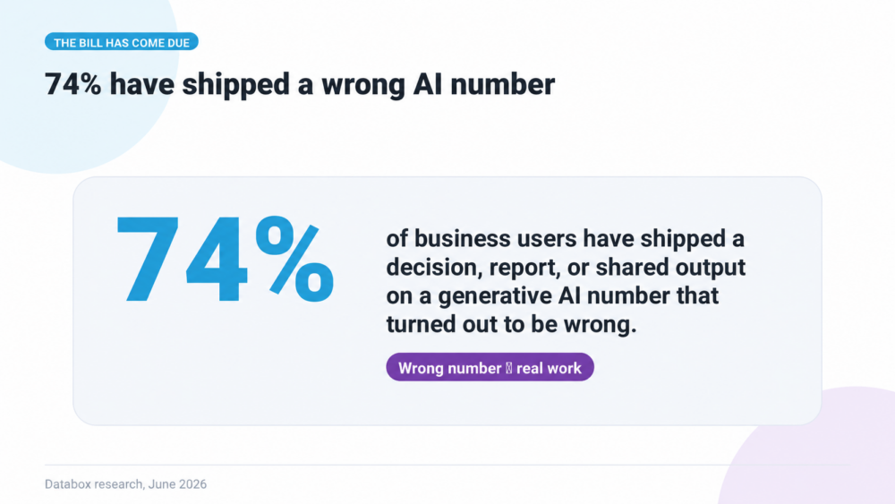
The speed brought two pitfalls, and both hide well. The first is partial sight. An AI that reads only the CRM answers a win-rate question from half the evidence, since the deals’ sources sit in ad platforms and their revenue sits in billing, and the answer still sounds complete because the AI writes it fluently. The second is bad arithmetic. Language models predict text, so when one sums a column of numbers it produces a plausible total that can be wrong, formatted exactly like a correct one. In Databox’s Using AI You Don’t Trust: How Business Users Actually Run Analytics in 2026 survey, 74% of business users had shipped a decision, report, or shared output based on an AI number that later turned out to be wrong.
The third pitfall is missing context. Numbers rarely explain themselves. An AI that reads the pipeline without knowing about the quota change in July or the campaign paused last month gives an answer that is technically correct and useless for the decision in front of you.
So the useful test for any sales dashboard tool now is whether it avoids all three pitfalls. It needs to see every system a sales question touches, know the business context behind the numbers, and run the math behind its AI on a real computation engine. The five criteria below measure exactly that.
Cross-tool data coverage. A sales dashboard earns its name when it reports on sales data wherever that data lives, including ads, web analytics, billing, product usage, and spreadsheets. An AI answer about pipeline is only as complete as the sources underneath it, so coverage sets the ceiling for every criterion that follows.
Blended and calculated metrics. The questions sales leaders bring to AI rarely live in one source. Pipeline coverage needs open pipeline from the CRM and quota from a planning sheet. Win rate by source needs CRM outcomes and the campaign that created each deal. A tool that charts each source separately hands the actual metric back to you and a spreadsheet, and an AI sitting on top of those separate charts inherits the same gap.
Where the AI does the math. Every tool below now advertises AI analysis, and the architecture underneath decides whether its answers survive a check. Some tools pass your numbers to a language model and let it estimate. Others run the calculation on a query engine and let the AI explain the computed result. The first approach fails without warning, since a wrong total reads exactly like a right one. Ask every vendor where the math happens before you ask what the AI can do, and ask what the AI knows about your goals, plans, and recent changes beyond the numbers themselves.
Time to a working dashboard for a non-analyst. AI promised sales leaders direct access to their own numbers. A tool that still needs an analyst to add a metric breaks that promise at the first new question, so the person who owns the forecast should be able to build the view behind it.
Forecasting and goal tracking on live data. A forecast is where every earlier criterion pays off or fails. It projects from blended data, using math the team has to trust, against goals the board will hold them to. A dashboard that reports history without projecting forward covers half the job.
Price stays off the criteria list on purpose. Most tools below span a free tier to enterprise contracts, and a cheap dashboard that cannot compute your pipeline coverage costs more than it saves.
When CRM-native reporting is genuinely enough
A single system of record changes the answer. A team that runs its entire revenue motion inside HubSpot, Salesforce, or Pipedrive, asks standard pipeline questions, and has an admin who knows the object model will get far with native reporting, at no added cost and with no new vendor. HubSpot’s reporting in particular serves single-stack teams well.
The segment stays small in practice. Reporting questions cross system borders as soon as marketing spend, billing, or product usage enters the conversation. Native reporting is the right answer exactly as long as your questions stay inside one database. The ranking below exists for everyone whose questions already left.
The 9 best sales & CRM dashboard software tools, ranked
| Tool | Data coverage & blending | Where the AI does the math | Setup for a non-analyst | Forecasting & goals |
|---|---|---|---|---|
| Databox | 130+ integrations plus databases and APIs; blends sources into calculated metrics | Statistical engine computes on governed metrics; Genie interprets the results | Same day, no warehouse or data team | Built in, on live metrics |
| HubSpot Reporting | HubSpot objects + synced data; cross-object on Pro/Enterprise, no external blending | Breeze Assistant reads CRM data; the AI report builder is single-object only | Fast inside HubSpot | Within Sales Hub |
| Salesforce Dashboards | Salesforce objects; outside data needs Data 360 or Tableau | Agentforce and Tableau Next (standalone or in Tableau+), on Data 360 | Fast for standard reports, admin work beyond | Strong, Salesforce data only |
| Pipedrive Insights | Pipedrive data only | AI Sales Assistant flags high-win-chance deals (Professional and up) | Fast inside Pipedrive | Revenue forecasts on Pipedrive deals |
| Tableau | Broad connector library; analyst-built joins and calculations | Governed via Tableau Semantics, on Tableau Next | Weeks to months | Custom-built |
| Power BI | Hundreds of connectors plus Fabric; blending via modeling and DAX | Copilot writes DAX, the engine executes it; needs Fabric F2+ or Premium capacity | Days to weeks | Custom-built |
| Zoho Analytics | 500+ connectors (some via middleware); auto-blending mostly between Zoho apps, manual lookups or SQL beyond | Ask Zia natural-language queries | Hours to days | Zia forecasting |
| Data Studio | Large partner connector gallery, upkeep varies; basic blending | Gemini and Conversational Analytics via BigQuery data agents; Google warns output can look plausible and be wrong | Hours for Google-stack basics | None native |
| Geckoboard | 90+ data sources; metrics built per source | Metrics MCP hands pre-calculated metrics to Claude and ChatGPT; no in-app analyst | Minutes | Goal tracking; alerts on paid tiers |
1. Databox: best overall for sales teams whose data lives in more than one tool
Databox ranks first because it is built for the situation most sales teams are actually in, with revenue data spread across the CRM, ad platforms, billing, and spreadsheets. It connects 130+ tools plus databases and custom APIs, keeps them synced, and ships thousands of prebuilt metrics, each defined once with its source and calculation. No warehouse or data team sits between the sales leader and the first answer.
Sales leaders work with it through Genie, the Databox AI Analyst. You ask a question in plain language, such as why mid-market pipeline coverage dropped this quarter, and Genie answers in seconds from live metrics, with the reasoning behind the answer. Pipeline by stage from the CRM, quota from a planning sheet, and spend from the ad platforms sit in the same platform and feed the same analysis. An answer worth keeping becomes an Artifact, an editable report you can share before the forecast call, and Routines run the same analysis on a schedule so the Monday numbers arrive without anyone asking.
Genie also works from the business context Databox stores alongside the data: your goals and plans, documents and call notes, memory from past conversations, and context pulled from your other tools through MCP connectors. An answer about a coverage drop accounts for the quota you raised or the campaign you paused, without a prompt that opens with three paragraphs of background.
The math behind that answer is where Databox separates from most of this list. Trend analysis, anomaly detection, correlations, and forecasting run on a statistical engine against your governed metrics, and Genie interprets the computed result. Whether a drop is a real problem or normal variation gets answered by statistics computed the same way every time, with no language model estimating it on the fly. Goals, forecasts, scheduled Routines, and the Databox MCP, which carries the same data and definitions into Claude and other AI tools, all run on that foundation.
The honest ceiling is that Databox is an analytics layer, and your CRM stays the system of record. Deal management, sequences, and rep workflows live in HubSpot, Salesforce, or Pipedrive, and Databox reads from them alongside everything they cannot see.
2. HubSpot Reporting: best when your entire revenue motion lives in HubSpot
For teams that run everything in HubSpot, native reporting covers standard pipeline questions with zero new vendors. The custom report builder crosses HubSpot objects on Professional and Enterprise tiers, and dashboards inherit the CRM’s permissions and familiarity.
Two ceilings matter. Breeze Assistant, included with every HubSpot subscription, analyzes pipeline from CRM data, while HubSpot’s AI report builder still creates single-object reports only, per HubSpot’s own knowledge base. The bigger ceiling is the data boundary. The moment ad spend or billing enters the question, you export, because HubSpot reporting reads HubSpot’s database and whatever syncs into it.
3. Salesforce Dashboards: best for large Salesforce-centric orgs with admin resources
Salesforce native dashboards and reports remain the deepest pipeline reporting available inside one CRM, and large revenue orgs run their forecast cadence on them. The dependency is the admin. Custom reporting beyond templates routes through people who know the object model, which turns every new question into a ticket and a wait of days.
The AI path follows the same pattern. Agentic analysis on Salesforce data runs through Agentforce and Tableau Next, which Salesforce sells standalone or bundled into Tableau+. Every Tableau Next customer gets a Salesforce org and a Data 360 instance, and Salesforce notes that other Data 360 costs can apply. The capability exists, and so does the separate invoice.
4. Pipedrive: best for small sales teams that run everything from the pipeline view
Pipedrive’s Insights reports and dashboards cover deals, activities, and revenue forecasts on Pipedrive data. Its AI Sales Assistant, on Professional plans and above, flags deals with a high win chance, answers forecast questions, and compares team performance over a chosen period. For an SMB sales team whose whole process lives in Pipedrive, that covers the weekly pipeline review without another tool.
The ceiling matches HubSpot’s. Insights reports on data inside Pipedrive, so win rate by campaign, pipeline against marketing spend, or bookings against billed revenue still means an export and a spreadsheet.
5. Tableau: best for organizations with a data team
Tableau offers the deepest analytical control on this list, and Tableau Next’s semantic layer, Tableau Semantics, gives AI features a governed foundation comparable in philosophy to Databox’s approach. The difference is who builds it and how long it takes. Implementations run weeks to months, assume analyst ownership, and the sales leader consumes what the data team publishes. Teams with that muscle get an excellent platform. Teams without it get a request queue.
6. Power BI: best for Microsoft-stack companies with modeling skills
Power BI brings hundreds of connectors, Fabric’s data platform underneath, and a Copilot that writes DAX executed by the engine, a sound architecture for the AI-math criterion. The cost is skill and licensing. Blended sales metrics require data modeling, Copilot requires Fabric or Premium capacity, and someone on the team must validate generated DAX. Where that someone exists, Power BI is a strong and widely adopted choice.
7. Zoho Analytics: best value for Zoho-stack teams on a budget
Zoho Analytics offers broad connectivity at a low entry price. It lists 500+ connectors, a figure that includes middleware reach through Zoho Flow and Zapier, and Ask Zia handles natural-language questions and forecasting. Auto-blending is narrower than the connector count suggests. It covers a short list of pairs, mostly between Zoho’s own apps plus HubSpot CRM with HubSpot Marketing or Xero. Every other combination needs a manual lookup between tables or a SQL query table, which keeps the sales leader dependent on whoever set up the workspace.
8. Data Studio (formerly Looker Studio): best free option, with a maintenance bill attached
Google renamed Looker Studio back to Data Studio in April 2026, and the product remains the strongest free dashboard tool for Google-stack reporting, with native GA4 and Google Ads connectors and a large partner connector gallery for the rest. The gallery is where the maintenance bill hides, since third-party connectors vary in upkeep and many production teams end up paying Supermetrics or Funnel for stable pipes. Conversational Analytics is now open to all Data Studio users, though it answers through BigQuery data agents someone has to build, and Google’s own documentation cautions that Gemini output can look plausible and be factually wrong. Native forecasting does not exist. Free describes the license, and rarely the total cost.
9. Geckoboard: best for putting live KPIs on a screen
Geckoboard does live KPI displays well, on an office TV, a shared link, or scheduled snapshots to Slack, Teams, and email, with 90+ data sources and setup in minutes. It also ships a Metrics MCP that hands pre-calculated metrics to Claude and ChatGPT, so an outside AI analyzes numbers Geckoboard computed. The ceiling is computation across sources. Geckoboard builds metrics per data source, so a blended number like pipeline coverage against spend still has to come from somewhere else, and there is no in-app analyst to ask.
Why Clari and Gong aren’t on this list
Revenue intelligence tools such as Clari and Gong Forecast answer a different question. They inspect deals and run the forecast call from CRM records plus emails, meetings, and call activity, which makes them strong at telling you whether a specific deal will close. They sit beside a dashboard tool in the stack. Teams that need both usually run revenue intelligence for deal inspection and a dashboard layer for the metrics that span marketing, sales, and finance.
Run the forecast test before you buy
One exercise settles most evaluations faster than a feature matrix. Take your real stack and ask each finalist for one view: pipeline coverage against quota for this quarter, blended with the spend that created the pipeline, built by the person who will actually own the dashboard, in under an hour. Tools that pass have answered the cross-source, blending, and time-to-dashboard criteria at once. Tools that fail will fail the same way after you buy them.
The stakes are the forecast itself. In Databox’s Managing Your CRM & Customer Data survey, 67.41% of teams said inaccurate forecasts damage strategic priorities and financial planning. A dashboard tool earns its spot in your stack by making the accurate path the fast one. Databox is ranked first here because it is built for exactly that test: connect the sources, blend the metrics, let the engine do the math, and let the AI explain what moved.
FAQs
Can HubSpot’s Breeze build a report that combines deals with ad spend?
Only within HubSpot’s own data. HubSpot’s AI report builder creates single-object reports only, and Breeze Assistant works from HubSpot’s CRM data. Blending deals with ad platform spend requires a cross-source tool such as Databox.
How does Databox keep AI answers consistent with the dashboard?
Genie answers from the same governed metric definitions the dashboards use, and trend analysis, anomaly detection, and forecasting run on Databox’s statistical engine. The AI interprets computed results, so the number in its answer matches the number on the dashboard.
Is Salesforce’s native dashboarding enough for sales forecasting?
For pipeline data living entirely in Salesforce, yes, its forecasting is among the strongest CRM-native options. Questions that mix Salesforce data with billing or marketing spend require Data 360 and Tableau Next, licensed separately.
Why does Data Studio rank below paid tools if it’s free?
The license is free while the operation often is not. Third-party connectors vary in upkeep, many teams pay Supermetrics or Funnel for stable ones, its AI answers depend on BigQuery data agents built separately, and forecasting does not exist natively.
Do I need to replace my CRM to use Databox?
No. Databox connects to HubSpot, Salesforce, and other CRMs as one source among many, so the CRM stays your system of record while Databox blends its data with ad, billing, and web analytics data.