The Advanced Settings window allows you to change the way data is displayed on the Datablock using advanced fields like Granularity, Format, and Scale.
HOW TO
- Access Advanced Settings
- Use Advanced Settings
- Set the Granularity
- Set the Format
- Set the Scale
- Set the Compare With value
- Set the Change Function
- Set the Change Format
- Use Auto-Update
- Use the Data Preview
How to access Advanced Settings
IN THIS SECTION
- How to access Advanced Settings from the Designer
- How to access Advanced Settings for Data Calculations
How to access Advanced Settings from the Designer
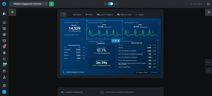
- Navigate to the Designer and click on the Datablock you want to access Advanced Settings for. This will open the Datablock Editor on the righthand side of the Designer.
- At the bottom of the Datablock Editor, click Advanced Metric Settings to open the Advanced Metric Settings window.
If you are using a Pipeline, Funnel, Table, Radial Progress, or Pie Chart visualization, you will need to click on a specific Row to reveal the corresponding Advanced Metric Settings link for that Row.
How to access Advanced Settings for Calculated Metrics
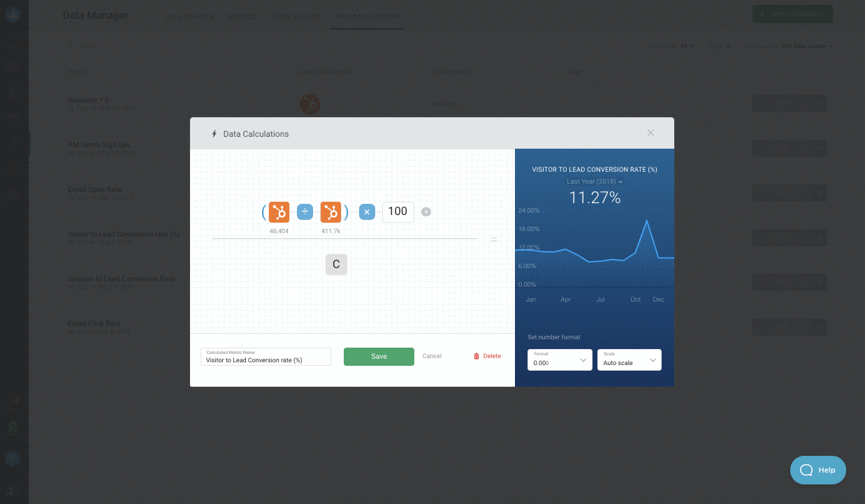
To open Advanced Settings for a Metric in a Calculated Metrics, open the Data Calculations window and click on the appropriate Metric in the equation. Click on the Adanced Settings icon in the top right of the selection window to open the Advanced Settings for the Metric.
How to use Advanced Settings
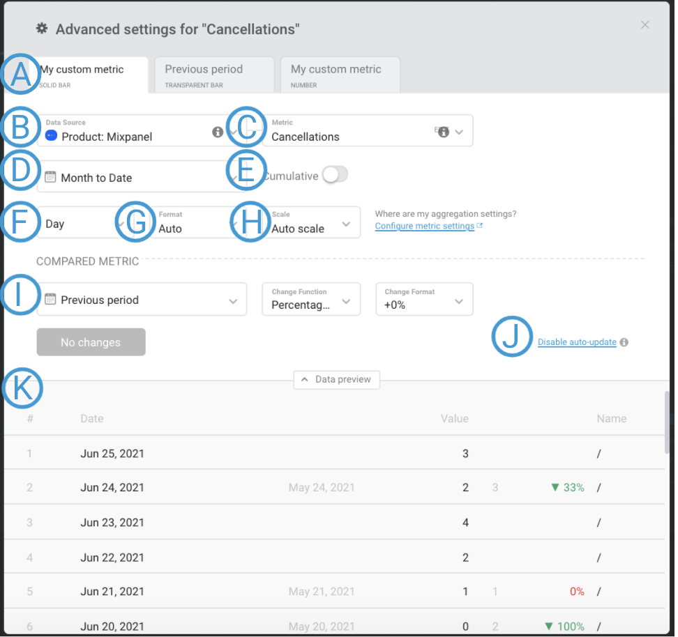
A) Tabs: Depending on the visualization, these Tabs may differ. For Charts, these Tabs represent the line (or bar), the comparison line (or bar), and the number that is displayed at the top of the graph.
How to set the Granularity
IN THIS SECTION
What is Granularity?
Granularity refers to the level of detail present in a set of data. This affects the presentation of a Line/ Bar Chart, and which Goal values the Metric is measured against.
Some Metrics support Hourly, Daily, Weekly, Monthly, and Yearly Granularity, while others have some limitations in terms of Granularity options. You can find more information on Granularity limitations in the Additional Information section of the appropriate Data Source Guide.
The Granularity that should be selected depends on the Date Range of the Datablock. In most cases, a Datablock with the Date Range of “This Year” or “Year to Date” is viewed with Monthly Granularity. This will result in a Line Chart that plots Monthly Metric Values. If Daily Granularity was selected, every individual day's Metric Value will be plotted on the Line Chart.
When This Quarter or Quarter to Date are selected on the Datablock, typically Monthly or Weekly is selected as the Granularity. This selection depends on the level of detail you want to view on the Line Chart. If Monthly is selected, 1 Metric Value will be plotted for each month in the Quarter. This means there will be a maximum of 3 data points on the Line Chart because there are 3 months in a Quarter. If Weekly is selected, 1 Metric Value will be plotted for each week in the Quarter. This means there would be a maximum of 12 data points on the Line Chart to account for each week in the Quarter.
Shorter Date Ranges like "This Month," "Month to Date," "This Week," "Week to Date," and "Last 30 Days" are typically viewed with Daily Granularity, so each day has a Metric Value plotted on the Chart. This allows you to closely analyze the data and easily identify emerging trends.
If you are viewing a Line Chart with Monthly Granularity, you can only compare to a Monthly Goal that is set for the Metric. Similarly, if you are viewing a Line Chart with Daily Granularity, you can only compare to a Daily Goal that is set for the Metric.
How to use Granularity [Examples]
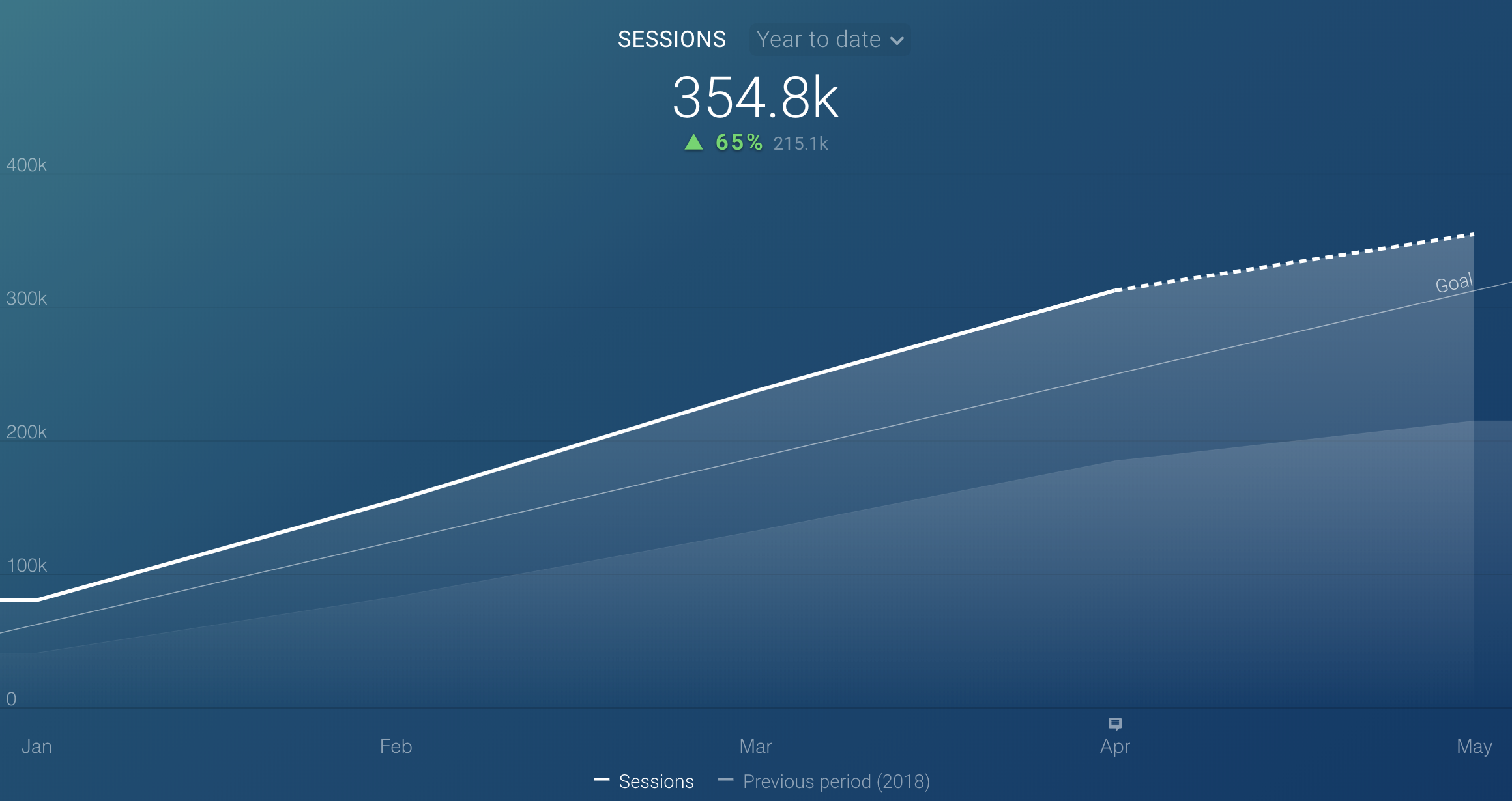
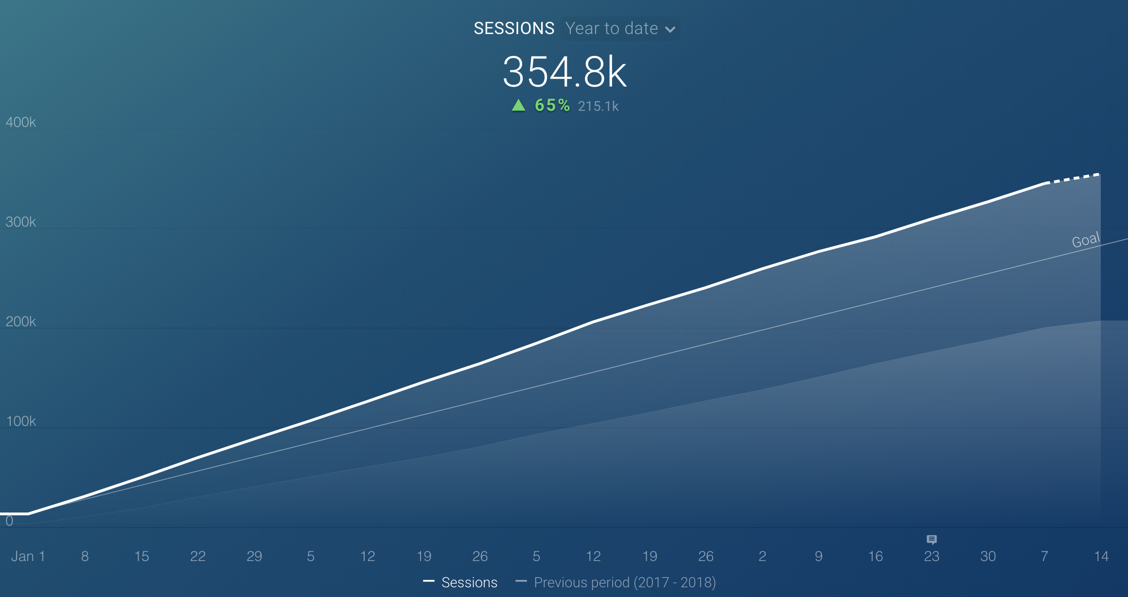
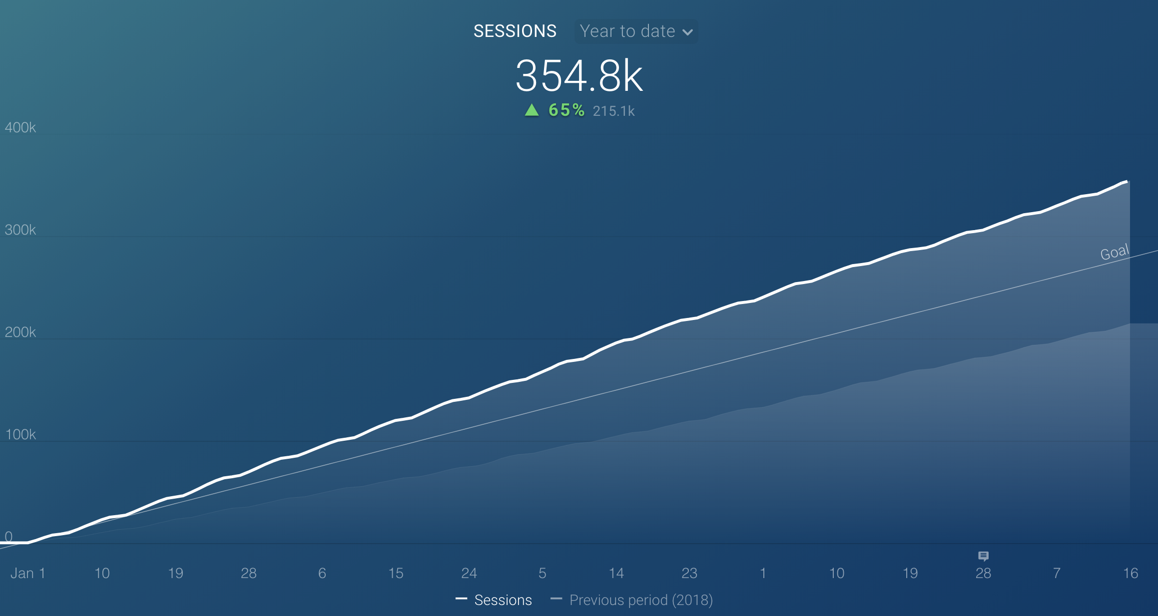
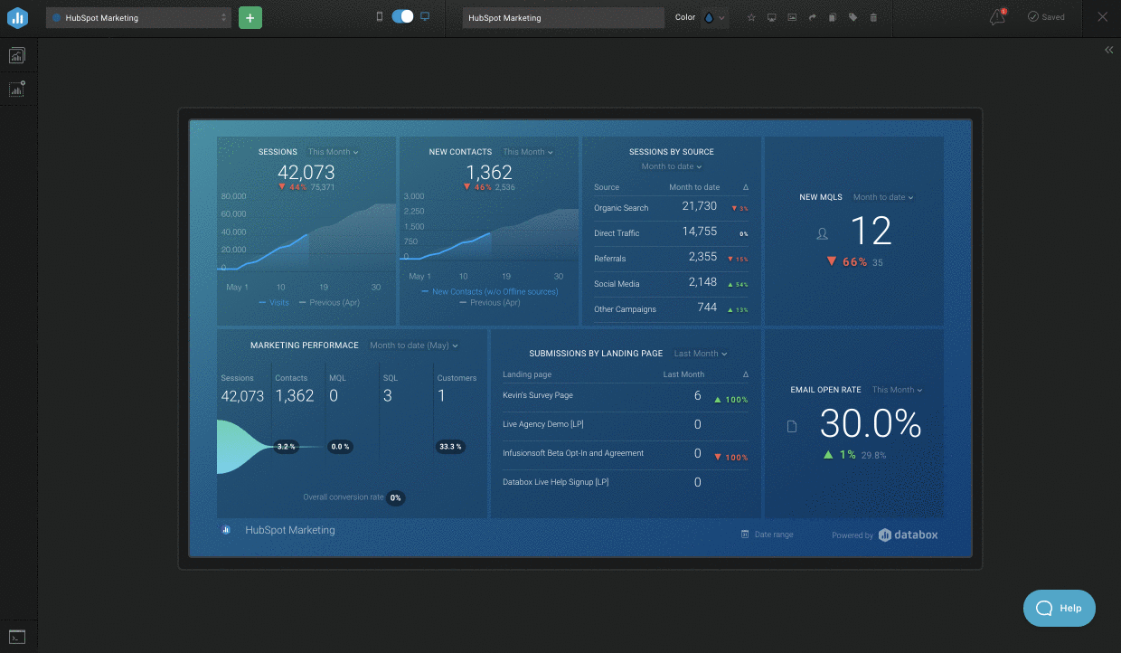
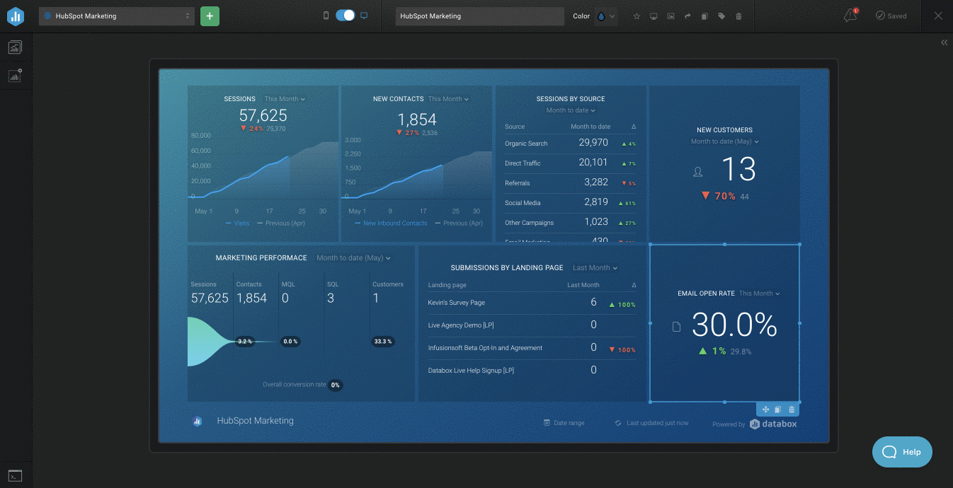
In this example, we will look at the Sessions Metric from HubSpot Marketing on a Line Chart with Year to Date selected.
If Granularity is set to Monthly, we will see the number of monthly Sessions for the year plotted on the Line Graph.
If Granularity is set to Weekly, we will see the number of weekly Sessions for the year plotted on the Line Graph.
If Granularity is set to Daily, we will see the number of daily Sessions for the year plotted on the Line Graph. When using Daily Granularity on a Chart with a longer Date Range, only some days will be visible on the x-axis. All daily values can be viewed by hovering over the line on the Datablock.
How to set the Format
IN THIS SECTION
What is Format?
The Format allows you to choose how you’d like to display Metric values.
You can choose between predefined, default Formats, or set up your own custom Format.
Basic Metrics have default Formats set in Databox. Here are some examples:
- $ Currency: “Recurring Revenue (Monthly)” (ProfitWell)
- Postfixed %: "Bounce Rate" (Google Analytics)
- Duration: “Avg. Time on Page” (Google Analytics)
In some cases, you may want to change the Format of a Basic Metric or set the Format for Custom or Calculated Metrics. You can do this by choosing one of the default Formats from the drop-down list, or by creating a custom Format by choosing + New Custom Format in the drop-down list.
This is especially valuable if you're dealing with Metrics that may have decimal values returned. You can use the + New Custom Format option to set how many significant digits you want to be included on the Datablock.
- If you set the Format to ''0.00'', the Metric value on the Datablock will always be displayed with 2 digits after the decimal place, regardless of the Metric value.
For example, if the Metric value returned for "Pages / Session" is 2.678, then 2.68 will be displayed on the Datablock. If the Metric value returned is 2.6, then 2.60 will be displayed on the Datablock. - Entering # instead of 0, like ''#.##'', may change the Format of Metric value displayed on your Datablock. With this Custom Format, 2 digits will be displayed only after the decimal place if the Metric value owns it.
For example, if the Metric value returned for "Pages / Session" is 2.678, then 2.68 will be displayed on the Datablock. If the Metric value returned is 2.6, then 2.6 will be displayed on the Datablock.
Learn more about Default Format options and how to add a Custom Format here.
How to use Format [Example]
Let's say you want to report on MRR from Stripe, but you want to display the Euro sign (€) rather than the Dollar sign ($). Along with that, you'd like to display Metric value digits, only if the Metric value owns it.
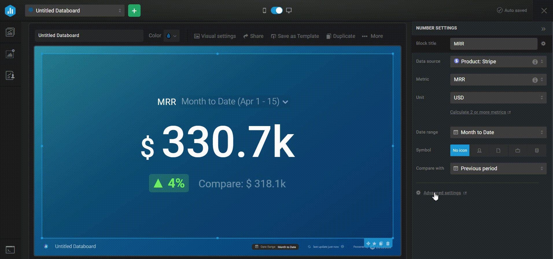
- Open Advanced Metric settings
- Open the Format drop-down list
- Select + New Custom Format in the Format field
- Enter € #,###.## in the Format field and click the green Save button
- In Advanced Metric settings, click on the green Save button
How to set the Scale
IN THIS SECTION
What is Scale?
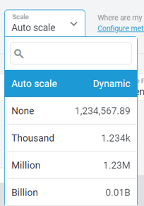
The Scale determines the rounding that is applied to the Metric Value. By default, Scale is set to Auto Scale, meaning as the Metric Value changes the Scale may change as well. This is done in an effort to display the Metric Value on the Datablock in the best way possible.
Selecting None for the Scale will make it so no rounding is applied to the Metric Value. The other options- Thousand, Million and Billion- will round the Metric Value based on the specified Scale.
How to use Scale [Examples]
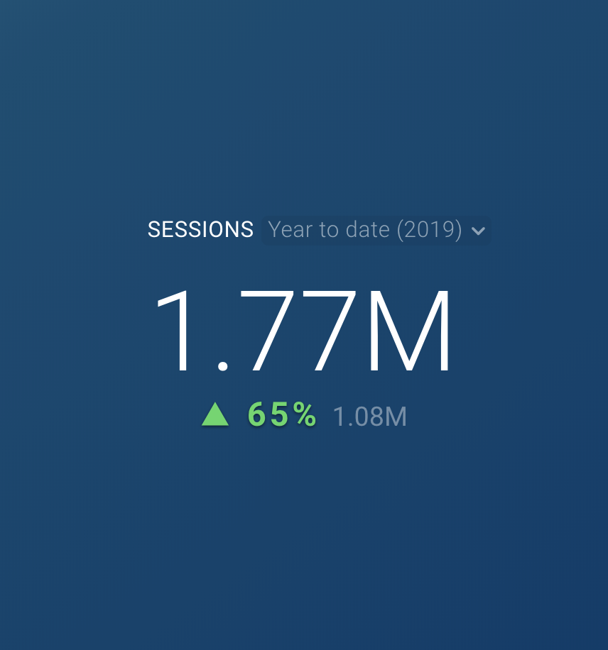
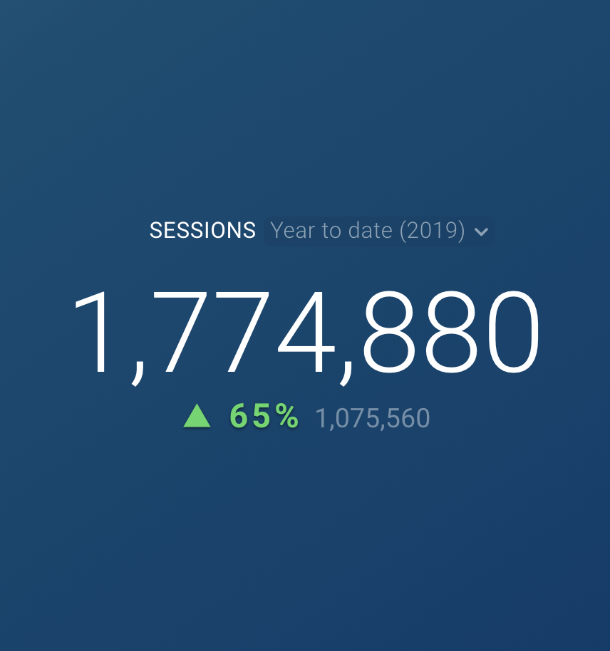
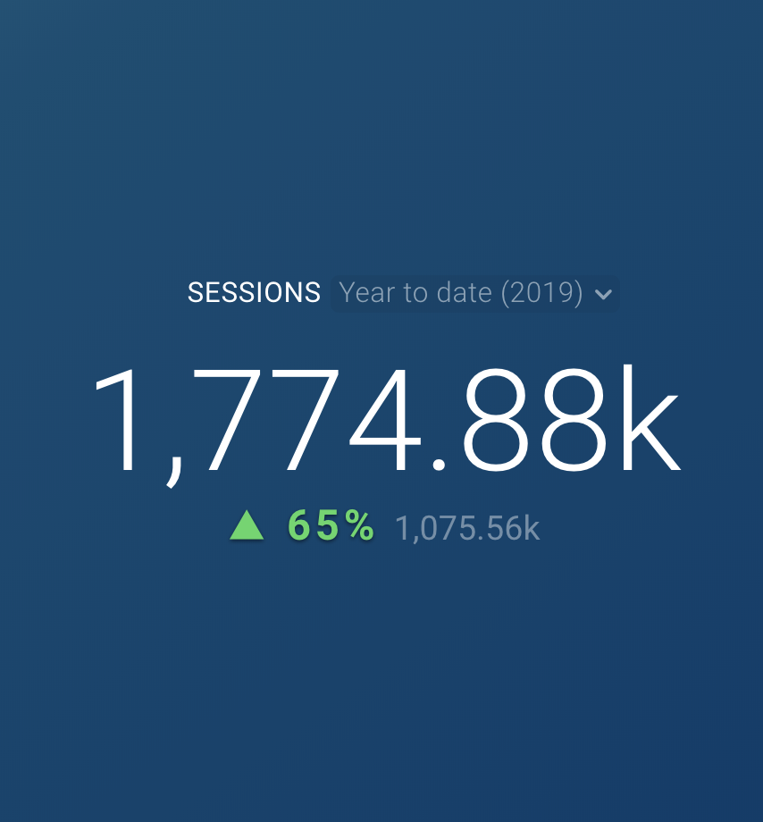
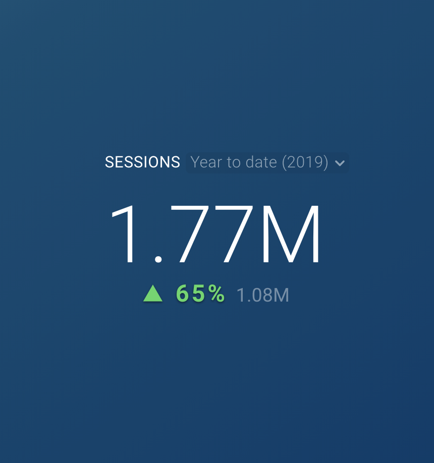
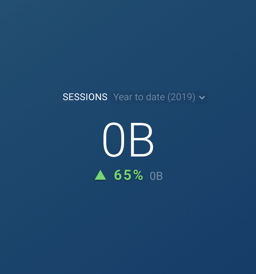
In this example, we will look at the Sessions Metric from HubSpot Marketing on a Line Chart with Year to Date selected. The number of Sessions returned for the current Year to Date is 1,774,880.
If Scale is set to Auto Scale, 1.77 M will be displayed on the Datablock. For this Metric Value, the Scale is automatically set to Million. If this Metric Value significantly increased, the Scale will automatically update to Billion.
If Scale is set to None, 1,774,880 will be displayed on the Datablock.
If Scale is set to Thousand, 1,774.88k will be displayed on the Datablock.
If Scale is set to Million, 1.77M will be displayed on the Datablock.
If Scale is set to Billion, 0B will be displayed on the Datablock:
How to set the Compare With value
IN THIS SECTION
What is Compare With?
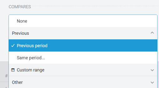
The Compare With selection can be updated in the Advanced Metric Settings window and in the Datablock Settings directly in the Designer. Using Advanced Metric Settings, you have the ability to select None, Previous Period, Same Period Last Year, Custom Range, Other Metric, or Goal to measure your Metric against. The data for the selected Date Range, Metric, or Goal will be measured against your current performance and displayed on the Datablock.
Not all visualizations support comparison data, so this section will not be visible in every Advanced Settings window. Learn more about which visualization types support comparison data here.
How to use Compare With [Examples]
Let's say we're looking at Sessions for the current Month to Date.
If Previous Period is selected as the Compare With value, the current month's performance will be compared to the previous month's performance at the same time.
If Same Period Last Year is selected as the Compare With value, the current month's performance will be compared to the current month's performance from the previous year.
If Custom Range is selected as the Compare With value, the current month's performance will be compared to the selected Custom Range period.
If Other Metric is selected as the Compare With value, the current month's performance will be compared to the selected Metric.
If Goal is selected as the Compare With value, the current month's performance will be compared to the Goal value set for the month.
How to set the Change Function
IN THIS SECTION
What is Change Function?
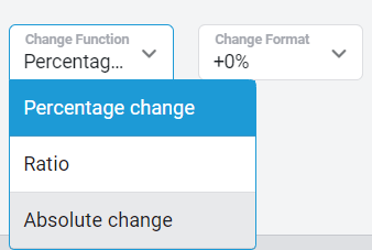
The Change Function refers to the way your current performance compared to the Compare With selection is displayed on the Datablock.
By default, Percentage Change is selected as the Change Function. If Previous Period is selected as the Compare With Value, this means that the percentage change from the previous period will be displayed on the Datablock. This is calculated through the following equation:
(Current Metric Value - Previous Period Metric Value) / (Previous Period Metric Value)
You can update the Change Function to show the Ratio or Absolute Change for the Metric. Selecting Ratio will change the comparison equation to the following:
(Current Metric Value / Previous Period Metric Value) * 100
Finally, selecting Absolute Change will make it so the difference between the previous period's performance and the current performance will be displayed on the Datablock. This will change the comparison equation to the following:
Current Metric Value - Previous Period Metric Value
How to use Change Function [Examples]
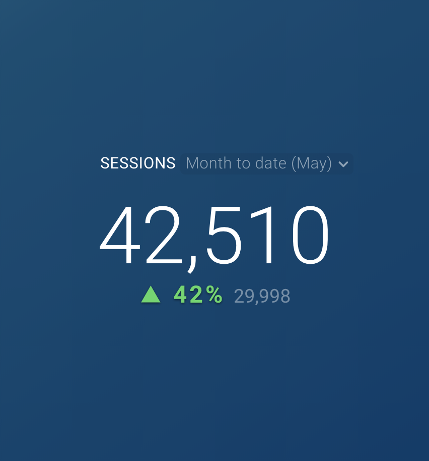
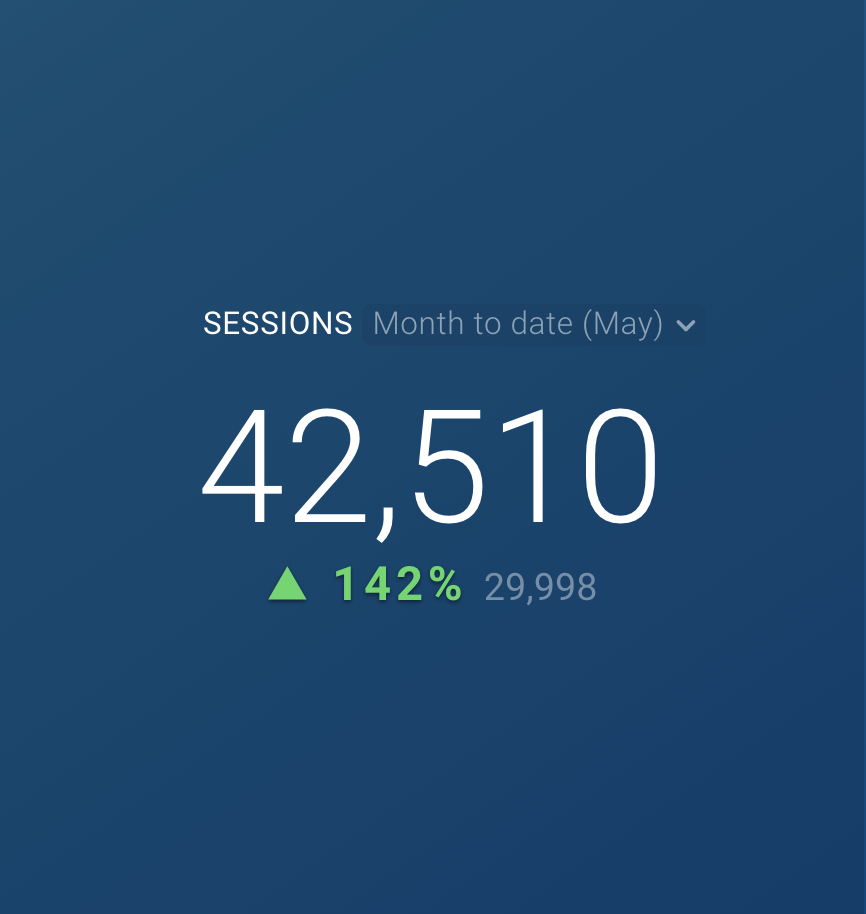
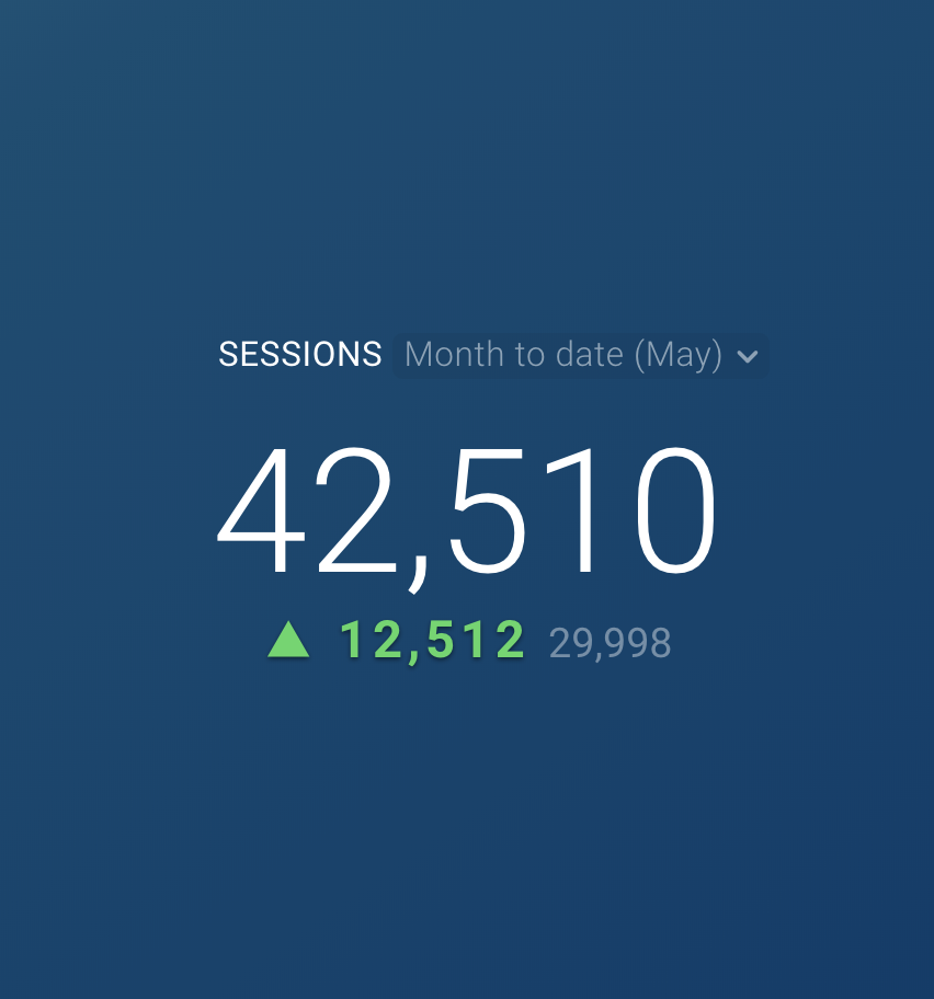
Let's say we're looking at Sessions for the current Month to Date and comparing to the Same Period Last Year.
So far this month, we have 42,510 Sessions tracked. Last year at this time, we had 29,998 tracked for the month.
If Percentage Change is selected as the Change Function, the following calculation will be performed on the backend:
(42,510 - 29,998) / (29,998) = 41.7
Therefore, 42% will be displayed on the Datablock.
If Ratio is selected as the Change Function, the following calculation will be performed on the backend:
(42,510 / 29,998) * 100 = 141.7
Therefore, 142% will be displayed on the Datablock.
If Absolute Change is selected as the Change Function, the following calculation will be performed on the backed:
42,510 - 29,998 = 12,512
Therefore, 12,512 will be displayed on the Datablock.
How to set the Change Format
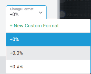
The Change Format works the same as the Format field, but this specifies the way the comparison data will be displayed on the Datablock. This field automatically updates based on the Change Function selected.
By default, the Change Function is set to Percentage and the Change Format is set to +0%. If the Change Function is changed to Absolute Change, the Change Format will automatically update to +0.
Learn more about Format options here.
How to use Auto-Update
For Chart visualizations, you will see Tabs indicating multiple Lines/ Bars and Numbers on your Datablock.
For visualizations that support multiple Date Ranges, you have the ability to treat each Date Range separately and configure unique settings.
By default, Auto-Update is enabled, meaning any changes you make to the first Tab or Date Range will update the settings for all other Tabs or Date Ranges as well. When Auto-Update is disabled, all Tabs and Date Ranges will be unique, so any changes you make to one Tab or Date Range will not be applied to other Tabs or Date Ranges.
You can also change the name of Lines on a Line Chart, Column Headers on a Table, etc. by clicking on the Tab title and directly entering the new title in the text field. Learn more here.
How to use the Data Preview
The Data Preview allows you to get a more granular view at the data included in the Datablock. This includes Dates, Metric Values, Comparison Period Values, and Comparison Change Values.
If you are viewing Sessions for the current Year to Date with Monthly Granularity selected, the Data Preview will show data for each month of the current year, up until the current month.
If you are viewing Sessions for the current Year to Date with Daily Granularity selected, the Data Preview will show data for each day of the current year, up until the current day.
As you make changes in the Advanced Settings window, the Data Preview will update to reflect your current selection. This allows you to verify your selections and ensure the Datablock is displaying data in an optimal way.
